Structures for Inclusion

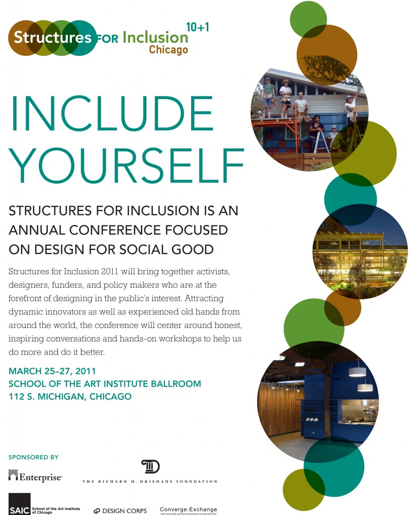
In a few short weeks, something amazing will be going down in Chicago. Sadly, I will probably not be able to attend this one, but Structures for Inclusion is an annual conference held by Design Corps. I mentioned Design Corps & Bryan Bell when sharing a little bit from Bruce Mau a few weeks ago. Bryan’s networking and ability to find fantastic, inspiring speakers for these conferences is evident when you look down the list of past conferences and speakers.

Structures for Inclusion 10+1

Structures for Inclusion 10+1

Four years ago, I was able to attend, with some college friends, the 2007 Structures For Inclusion conference. Showing just how long ago that was, I had to dig into my Myspace blog archives to dig up what I said about it (Totally unedited, so read at your own risk):

This was the most inspiring conference / combination of architectural speakers I’ve heard thus far… I’m far too excited about it to keep mum, it was hosted at UNCC by Design Corps they do a ton of fantastic work for people who actually need good architecture and can’t afford it. (Unlike the rest of us who have mortgages to pay, pets to feed, etc) I’m really looking forward to breaking into the whole design-build business world. (In particular because after we get going for a while we should be able to make a real difference in the community without sacrificing the need to eat and have shelter ourselves.) Here are a few of the speakers:

Steve Badanes

Steve Badanes

Steve Badanes of Jersey Devil Design Build told us about many of his adventures in design build, both recently and back in the 70s (really paved the way for a lot of other firms to follow)

Heavy Trash

Heavy Trash

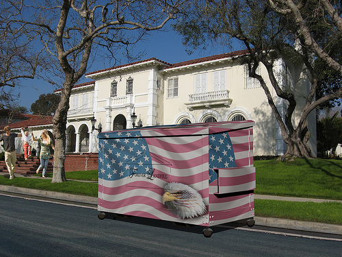
Unnamed woman of Heavy Trash an anonymous group of artists & architects in the L.A. area whose focus is bringing attention to social issues in the L.A. area by means of massive pieces of installation art (“heavy trash” which they are careful to keep from being permanent, thus being guilty only of littering)

Ronald Lewis - Project Locus

Ronald Lewis - Project Locus

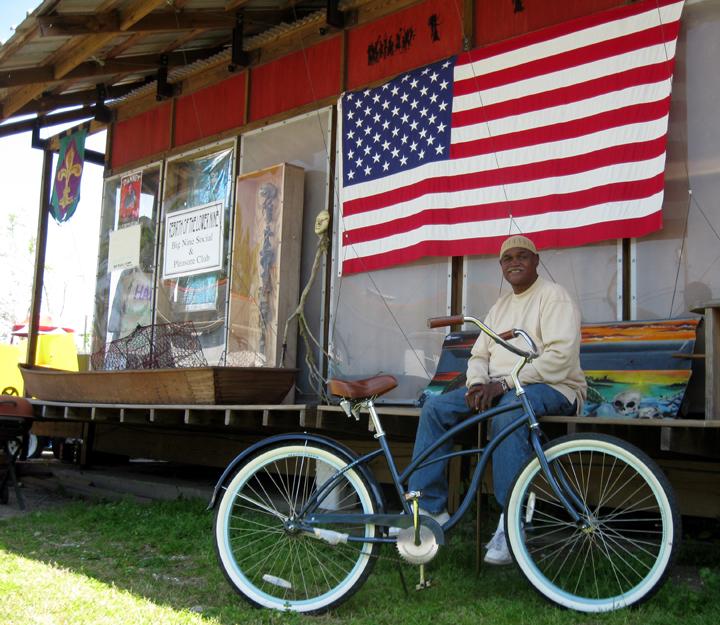
Ronald Lewis & Patrick Rhodes, Patrick formed the nonprofit group Project Locus and together they built for Ronald’s community (a residence of the N.O.’s ninth ward) the House of Dance and Feathers a community museum focused on the costumes & cultural heritage of the Mardis Gras festival.

Tsunami Safe(r) House

Tsunami Safe(r) House

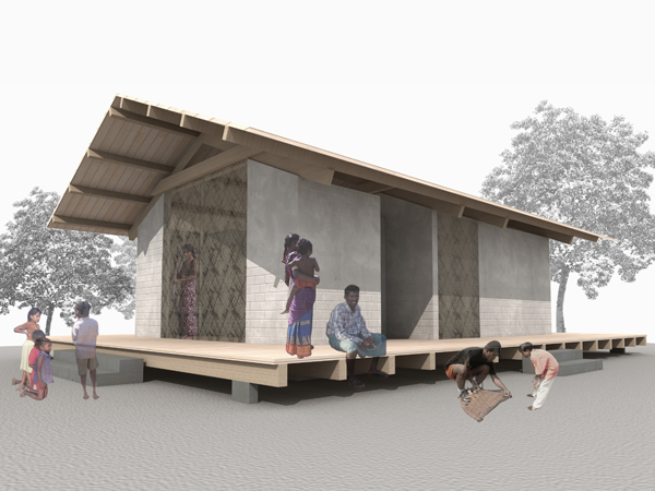
Justin Lee who is in large part responsible for the Tsunami Safe(r) House Project.

International Design Clinic

International Design Clinic

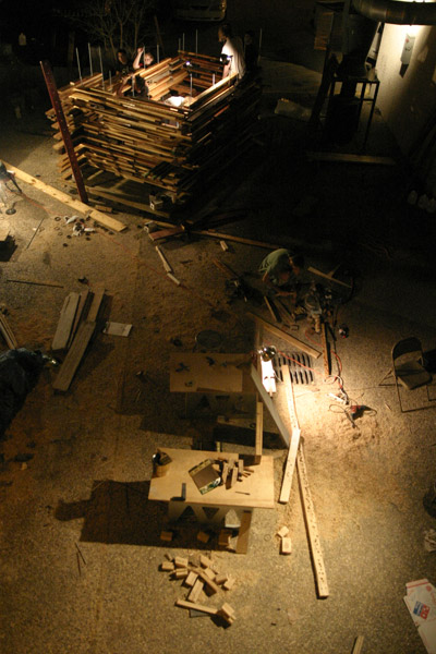
Scott Shall founder of the International Design Clinic who do some more fantastic Guerrilla Architecture world wide. (One project for a women’s shelter in modern day Romania was incredibly inspiring)

Phoebe Crisman worked on the Learning Barge Project whose aim is to educate both children and the public in the Norfolk Area about the local ecosystems as well as damage currently being inflicted on those systems by the shipbuilding industry, and at the same time gives ides of how the industry can be lower impact and make the surrounding community a better place to live rather than the ultra-poor, toxic, often cancer riddled area.

I could keep going and going… There is more information here SFI Speaker List
and below are a handful more links for more groups (I’m simply spending too much time on this post)

The Artemis Institute
Tonic Design
The Homeless Task Force (whose site appears to have issues right now)

Anyway, I’m gonna get back to work… the scent of fresh coffee calls, but thought anyone who wasn’t able to come out to the conference might be interested, as well as those of you non-architect people out there. (See we’re not all about ourselves)
Posted in Architecture | Tagged Chicago, Good Deeds, Good Design, Structures for Inclusion | Comments closed

New Modern House – Hillsborough, NC

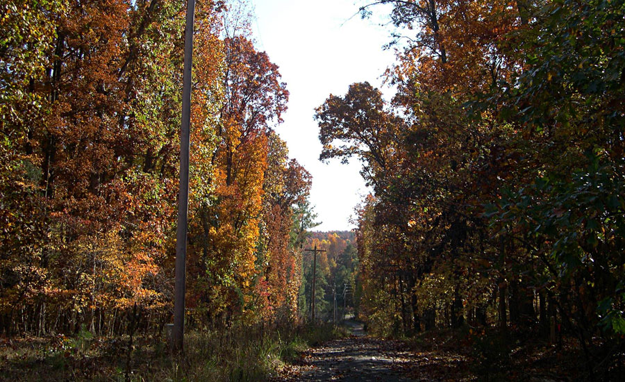
In 2008, our firm was commissioned to create a new single family residence in Hillsborough, North Carolina. As was the case with the Dabbs residence, I had the opportunity to make first contact and meet with Michael and Gerry on site. The lot was steeply sloped, with a generous canopy of hardwood trees, well into the vibrant hues of a Carolina autumn.

Red Hawk Road - November 2008

Red Hawk Road - November 2008

After speaking briefly about our firm, projects we’d completed, and our process, we parted ways and I drafted up the design proposal for what I hoped would be another fantastic house in the country. Little did I know, the home that would arise out of the early sketches would become this affordable, green, modernist retreat.

Riverbirch Residence - East Elevation

Riverbirch Residence - East Elevation

From the very first sketches it became clear that the site constraints, context, and client needs would mandate something different from the more traditional structures we most often get asked to design.

Sustainability was a key discussion point from the first meeting. Rather than “building green” to make a statement, the clients were genuinely concerned about the impact of their new home on the landscape. Solar orientation was aimed at maximizing daylight, and passive solar heating in the winter. Overhangs were sized to block the harsh summer sun, while letting sun in during the cool evening months. The inverted sloped roof collects rainwater for local irrigation, minimizing the use of potable water in landscaping. The landscape plan utilizes a combination of indigenous and drought tolerant vegetation.

Using an engineered building envelope and properly sized HVAC system, we were able to minimize operational costs on the home, including a monthly guaranteed maximum utility cost. Where possible, we selected materials that were recycled, rapidly renewable, or locally manufactured.

Riverbirch Residence - Southeast Corner

Riverbirch Residence - Southeast Corner

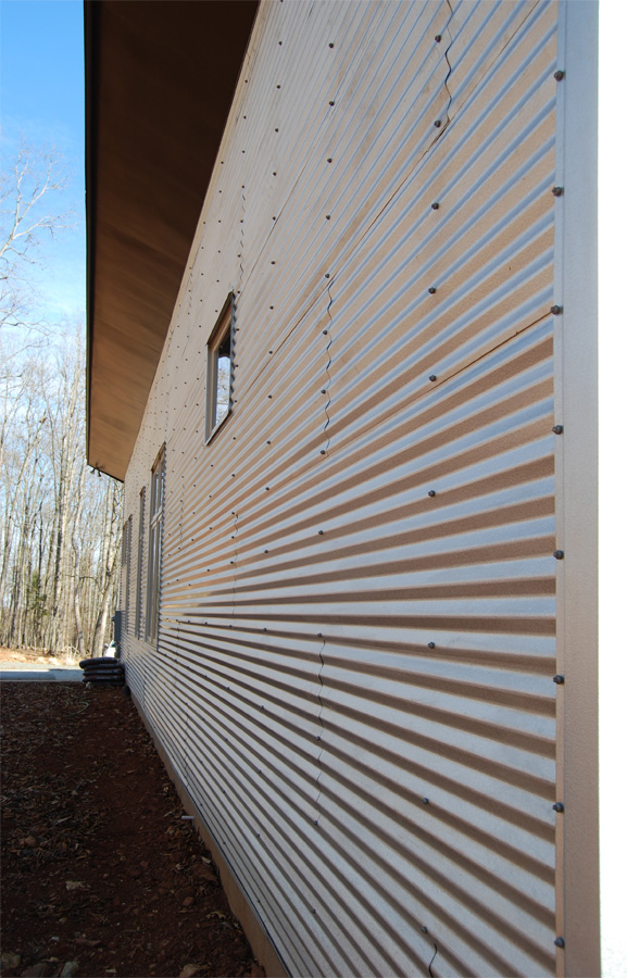
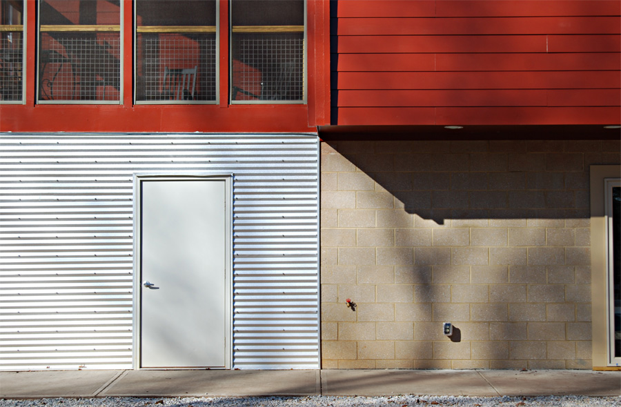
A material palette was selected to respond to the rural context, in the case of the lap-siding painted a traditional barn-red seen all over rural North Carolina, as well as a corrugated siding that is at once both a hint at the agrarian structures surrounding the home, as well as the industrial power substation located nearby.

Riverbirch Residence - Front Porch

Riverbirch Residence - Front Porch

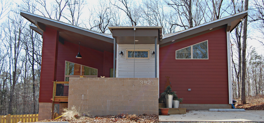
A generous front porch welcomes guests in, while providing ample views to the south.

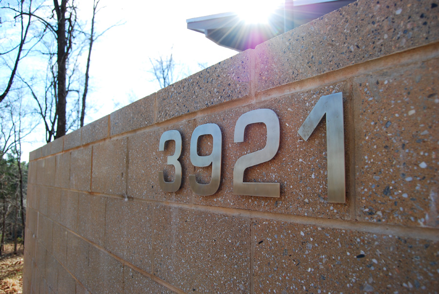
Riverbirch Residence - Steel Numbers & Block

Riverbirch Residence - Steel Numbers & Block

The masonry selected were an attempt to balance the red-clay colors of the local soil with the grays of stone and the trees on site.

Riverbirch Residence - Local Symmetry

Riverbirch Residence - Local Symmetry

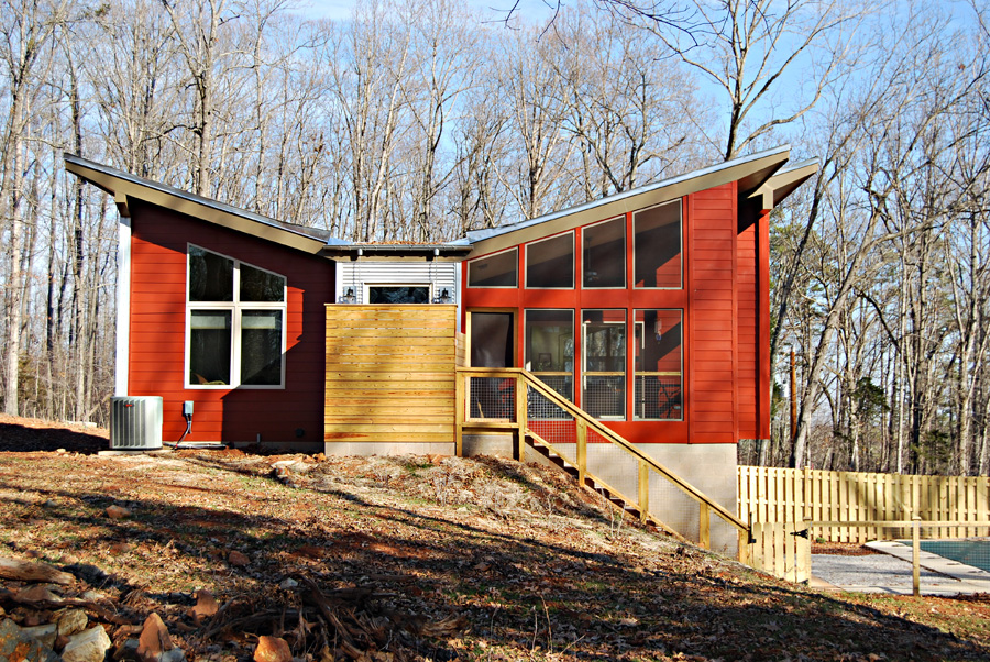
Riverbirch Residence - West Elevation

Riverbirch Residence - West Elevation

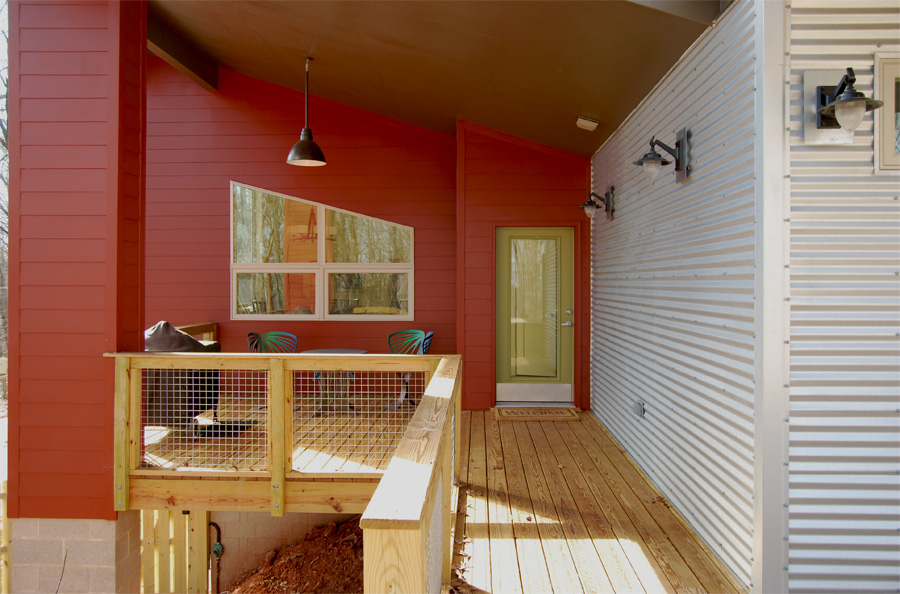
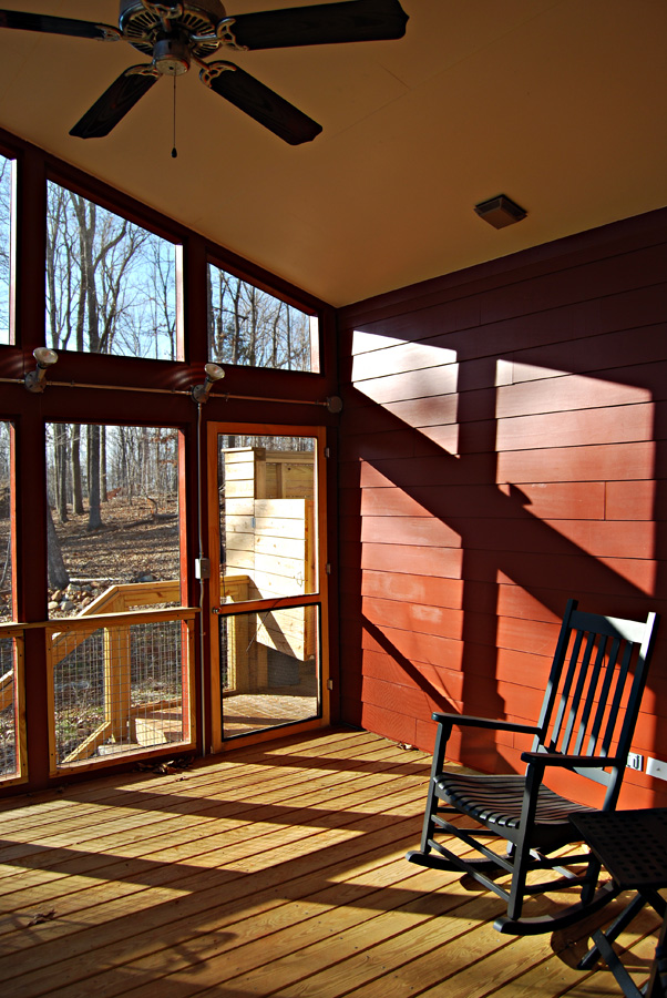
The screened porch is located to take advantage of the predominantly southern views, and the sun setting over the wooded hills to the west.

Riverbirch Residence - Galvanized Corrugated Siding

Riverbirch Residence - Galvanized Corrugated Siding

Riverbirch Residence - Material Palette

Riverbirch Residence - Material Palette

Carefully composed compositions throughout the structure act as a backdrop to the natural beauty of the site.

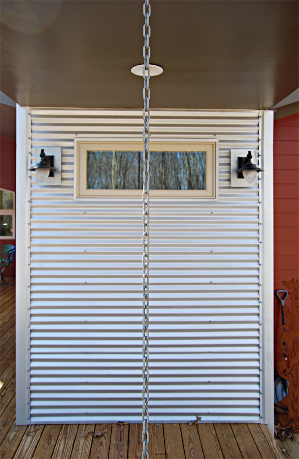
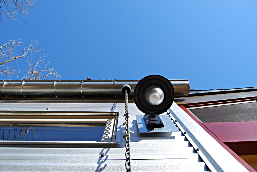
Riverbirch Residence - Rainchain, Galvanized Siding, Lamp

Riverbirch Residence - Rainchain, Galvanized Siding, Lamp

Riverbirch Residence -Rain Chain

Riverbirch Residence -Rain Chain

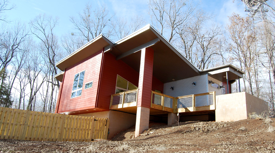
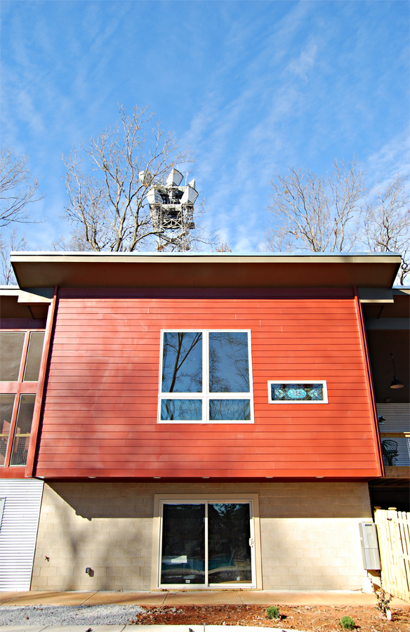
Riverbirch Residence - South Elevation

Riverbirch Residence - South Elevation

Local balance and symmetry is featured heavily on the exterior of the structure, with openings framing views and responding to interior functions. The main living volume cantilevers over the walkway to the basement for weather protection.

Riverbirch Residence - Screened Porch

Riverbirch Residence - Screened Porch

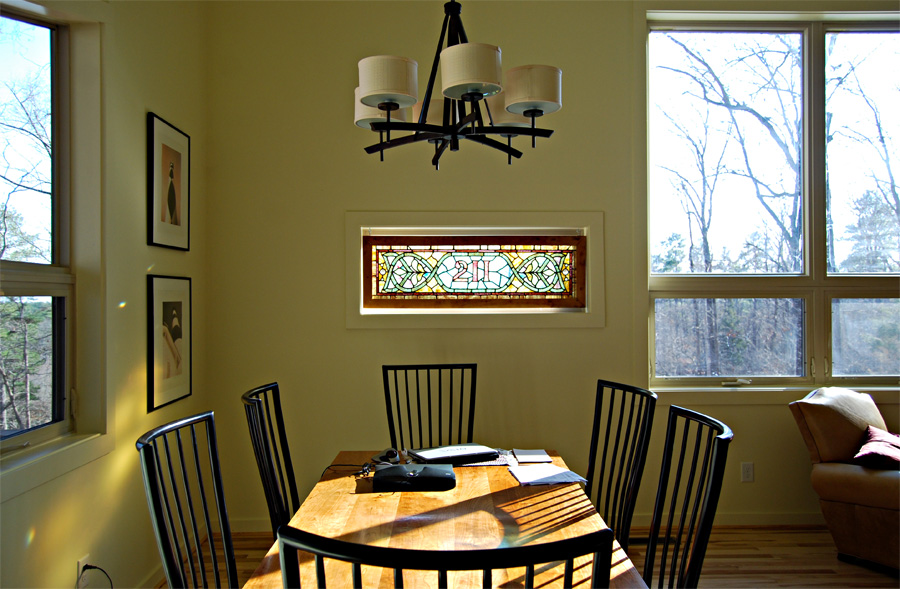
Riverbirch Residence - Dining Room

Riverbirch Residence - Dining Room

Interior spaces are bathed generously with sunlight, in an airy space that feels much larger than it really is.

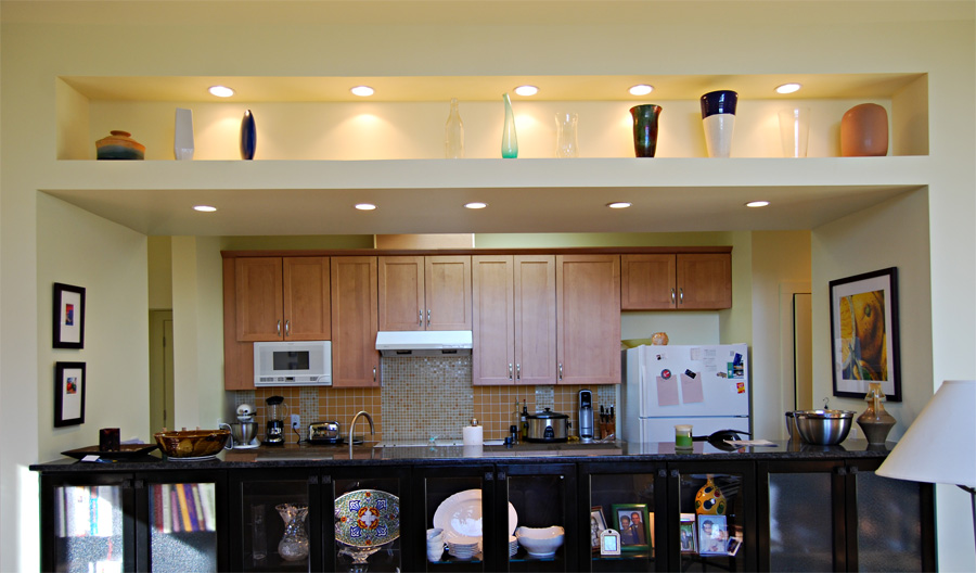
Riverbirch Residence - Kitchen & Art Shelf

Riverbirch Residence - Kitchen & Art Shelf

Built in shelves showcase the couples ceramics collection, and a skylight over the kitchen brings natural light deep into the center of the house.

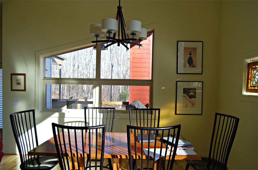
Riverbirch Residence - Dining Area facing East

Riverbirch Residence - Dining Area facing East

Older posts from during the construction process can be found here and here. Energy modeling and insulation by Prime Energy Group. You can also find information about this house on my page at Triangle Modernist Houses. I can’t thank Michael and Gerry enough for the opportunity to help make this house a reality, and I couldn’t be happier with the results.

Posted in Architecture, Sustainability | Tagged green building, modernism, sustainability | Comments closed

Rural Residence – Holly Springs, NC

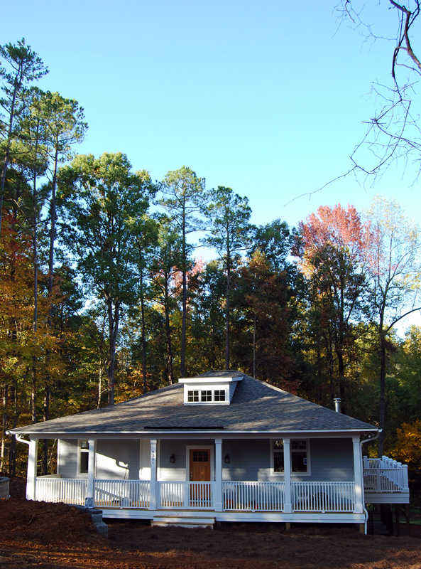
In late 2007, our firm was contacted by Chris and Christine Dabbs to design for them a small, single family residence, to be located on a wooded lot they’d recently purchased in Holly Springs. The Dabbs were moving from California back to good old North Carolina to retire, and spend more time in the company of their children. The lot was relatively ‘in the country’ and they wanted a structure that felt right at home in the Carolina pines.

Front Porch of the Dabbs Residence - Holly Springs, NC

Front Porch of the Dabbs Residence - Holly Springs, NC

In spending a lot of time looking through Architecture and shelter magazines, it’s easy to overlook traditional, vernacular design as a source of inspiration. But there are lessons to be learned from the vernacular, valuable lessons that ought not be overlooked. Take the front porch for instance, a deep, welcoming front porch shades windows from direct sunlight, while simultaneously brings visitors into the house.

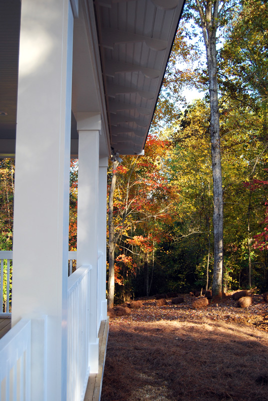
Front Porch Columns - Holly Springs, NC

Front Porch Columns - Holly Springs, NC

A nicely proportioned column gives not only the literal support needed for the porch, but conveys a sense of stability and structure that the average person picks up intuitively.

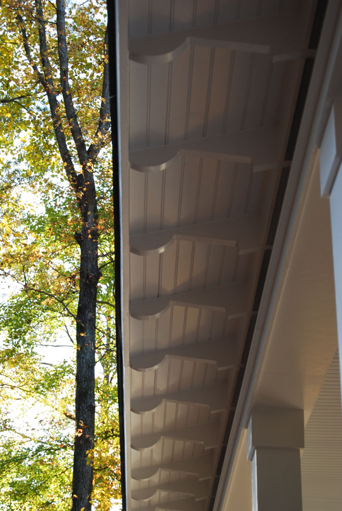
Overhang Detail - Holly Springs, NC

Overhang Detail - Holly Springs, NC

Functional details can become something more. Deep overhangs are present on vernacular structures for their shading abilities, much like the front porch, and also for getting large amounts of water out and away from the structure during the heavy Carolina rainstorms.

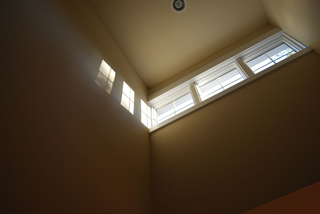
Clerestory Detail - Holly Springs, NC

Clerestory Detail - Holly Springs, NC

High, operable windows bring natural light into lower spaces, and allow for passive ventilation via the stack effect, bringing in cooler air while letting warm air out. You may have noticed small structures popping out of the roofs of old tobacco barns, they’re operating in much the same way.

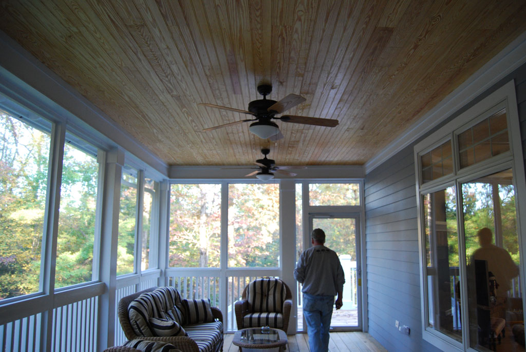
Screened Porch - Holly Springs, NC

Screened Porch - Holly Springs, NC

And don’t forget the screen porch. There are more than 60 species of mosquito in the Old North State, and while they don’t all bite humans, you can bet the ones that do will find you. A screened porch can be the perfect outdoor extension of the house, and in our temperate climate, a screened porch can be comfortable for nearly nine months out of the year.

For additional photos and my comments while the Dabbs residence was under construction in 2008, click here and here. Much thanks to Elliot with EMK Construction, Inc. for making Chris & Chris’s dream a reality, and to Chris and Chris for being some of the finest clients I’ve ever had the privilege of working with.

Posted in Architecture | Tagged farmhouse, north carolina, vernacular | Comments closed

Stanmar Leisure Homes (House Catalogs Continued)
Update 2023: While I haven’t built any of these updated variations on the Stanmar Leisure Homes to date, I have found a surprising amount of interest since originally posting this post. Some new and exciting information coming soon, and connected with several folks who have purchased and lovingly restored these old houses since writing this. If that’s you, or you’re interested in talking about building one, please email me at rusty@goodwork.design.

About a month ago, I shared my personal affinity for vintage house catalogs. Well, tonight I’m sharing my personal favorite of any house catalog I’ve ever seen.

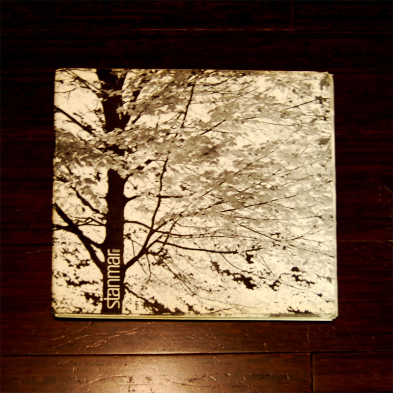
The Stanmar Leisure Homes catalog, 1966.

Stanmar Leisure Homes - 1966 - Cover

Stanmar Leisure Homes – 1966 – Cover

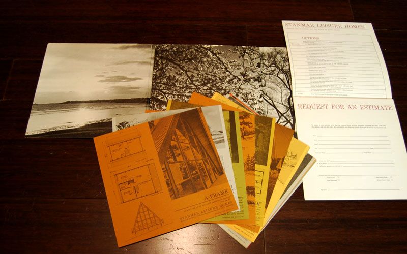
One of the first lessons I learned in design school was that presentation matters, and this catalog does not disappoint. In fact, to call it a ‘catalog’ is not really fair. This publication, with individual cards for each of the speculative house plan kits complete with photograph, brief narrative, and plans on the front; and specifications and features on the back, is hardly your average house plan book.

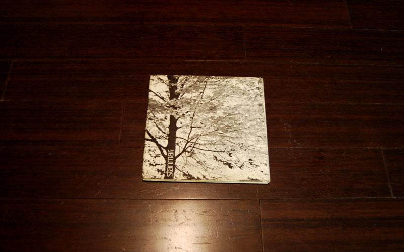
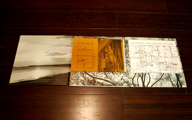
I can’t help but love everything about it. Take the overall package, 8.5″x8.5″ square. Or the unfolding of the outer envelope itself.

Stanmar Leisure Homes - 1966 - Closed

Stanmar Leisure Homes – 1966 – Closed

Stanmar Leisure Homes - 1966 - Opened

Stanmar Leisure Homes – 1966 – Opened

Stanmar Leisure Homes - 1966 - Expanded

Stanmar Leisure Homes – 1966 – Expanded

Everything, down to the heavy textured and colored paper feels and looks just right. Wonderfully picked earthtone pages with informative, readable, graphics and text.

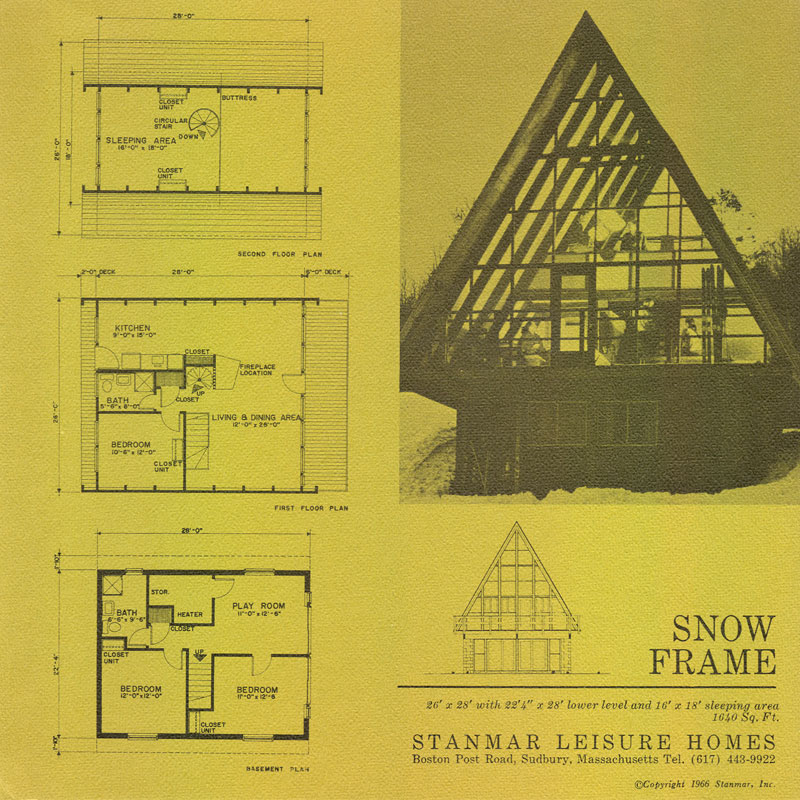
Stanmar Leisure Homes - 1966 - Snow Frame

Stanmar Leisure Homes – 1966 – Snow Frame

I’ll admit to being more than just inspired by this little pamphlet. I may very well be in love, and to top it off, here’s a magnificent quote from the back of the cover:

A Stanmar Home would have no justification if it were just a collection of quality building materials assembled with skill, zest and imagination.

But it’s a great deal more than that.

It’s a concept of living; a concept of freedom and privacy, and flexibility – a wonderful place to live – a place, your own place, where you and your surroundings may be completely in harmony.

Today’s online planbooks and webpages really pale in comparison to the thoughtful nature of both the design of the homes themselves, and the catalog. Which begs the question, “What ever happened to the brilliant people that came up with this?”

Well, they’re still around, but have moved on to bigger things. Stanmar Inc. is now a design and construction company of large multipurpose facilities all over the nation. Maybe I’ll call up Mark Snider, the current president, and ask if they have any extra copies of the old publications laying around the office.

Posted in Architecture | Tagged housing, prefab, Stanmar Leisure Homes | Comments closed

Vernacular Architecture of Eastern North Carolina 64 East

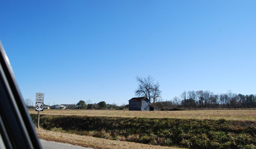
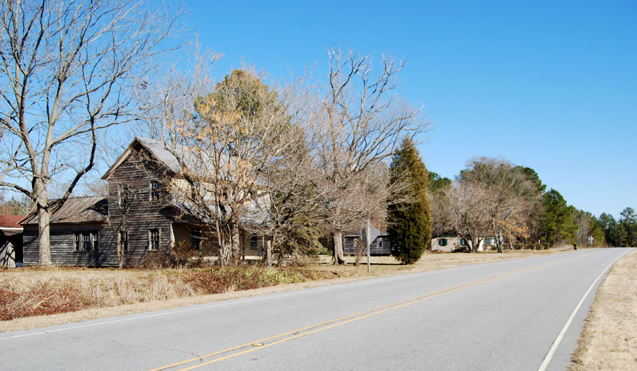
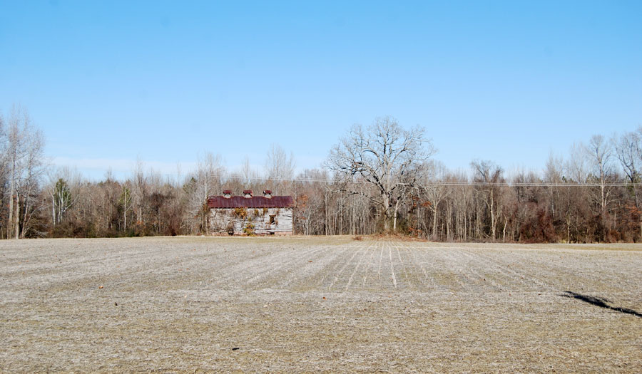
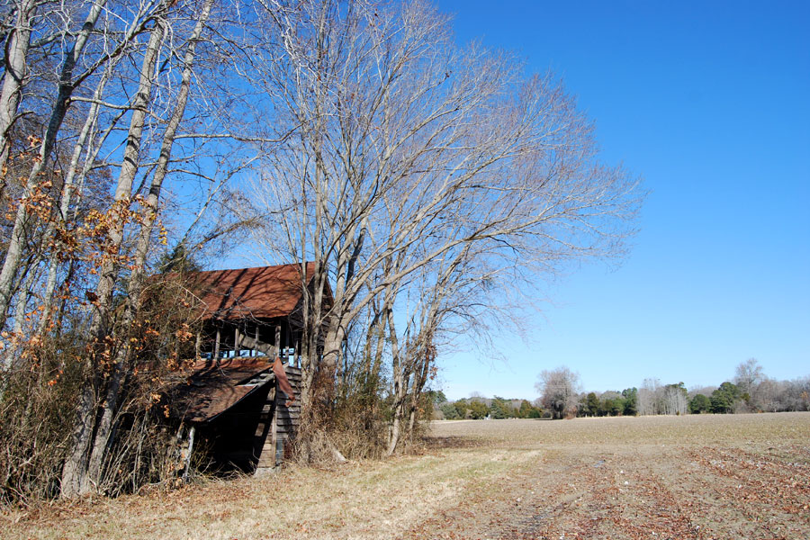
On the trip back from Creswell last Friday, I took a handful of pictures of old farm structures in various stages of disrepair and neglect.

I manage a trip out to eastern North Carolina about once a week, and I’m always drawn to these proud, but slighted, structures. Usually I just go about my business, driving on home to Raleigh. This past week, I took a few pit-stops along the way, grabbing photos of a few that stood out.

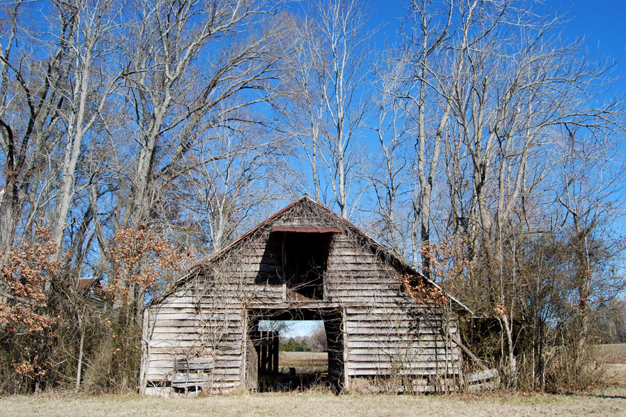
Gabled Barn Structure - NC
Gabled Barn Structure – NC

Barn and Field - NC
Barn and Field – NC

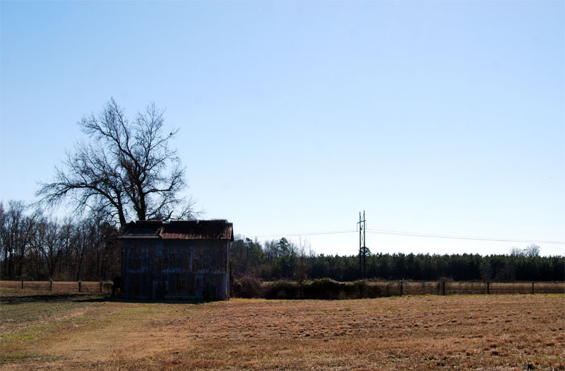
Tobacco Barn - NC
Tobacco Barn – NC
Farmhouse - NC
Farmhouse – NC
Tobacco Barn with Cupolas - NC
Tobacco Barn with Cupolas – NC
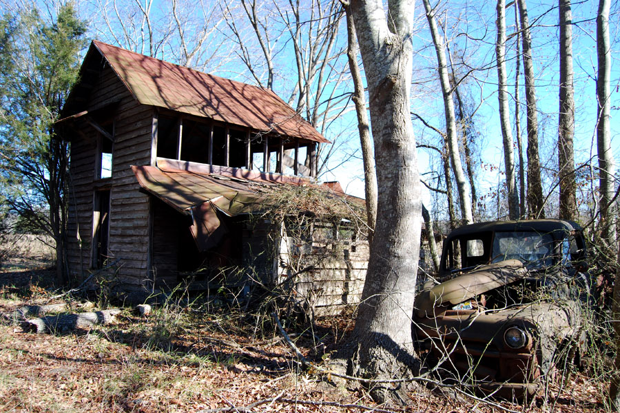
Abandoned House in the Woods - NC
Abandoned House in the Woods – NC
House and Dodge Pickup - NC
House and Dodge Pickup – NC

As a bonus, while taking shots of this old house I came across a rusted out Dodge pickup (Apparently a B-Series from the late 40s to early 50s.)

Dodge Pickup - 1948-1953 - NC

Dodge Pickup - 1948-1953 - NC

Dodge Pickup - 1948-1953 - NC

Dodge Pickup - 1948-1953 - NC

Whether we’re talking about houses, or pickup trucks. They sure don’t make them like they used to.

Posted in Architecture | Tagged barn, dodge pickup, Photography, vernacular architecture | Comments closed